
Monday, April 30, 2012
Sunday, April 29, 2012

Friday, April 20, 2012


Thursday, April 19, 2012

Sunday, April 15, 2012


Friday, April 6, 2012


Sunday, April 1, 2012


Sunday, March 25, 2012


Sunday, March 18, 2012
 |
| 4 senses in dry medium oil crayon. 1. excited 2. depressed 3. nervous 4. aggressive |
 |
| 4 verbs in wet medium indian ink 1. skipping 2. soaring 3. flowing 4. frowning |
 |
| Contour dry medium pencil, Blind Contour dry medium pencil, Gesture dry pencil , Gesture Wet Indian Ink |
 |
| Change jar from 4 different views. Top to bottom, Bottom to top, Tilted, Upright |
Monday, March 12, 2012


Sunday, March 4, 2012
This was a challenge but once I got going it made more sense.

 Lots of hands with out them we would not know how to visualize what we feel. Visually we would not know what soft looked like with out having had touched something soft We would not know what rough would look like if we had not touched something rough so the hands are where it all begins.
Sunday, February 26, 2012
Positive and Negative Utensils
 |
| Juggler |
 |
| Volcano |
Wednesday, February 8, 2012

I am on a bee kick from my last class and project. So I just started to cut and paste in photoshop. I have limited knowledge so It took me way to long. The large out of scale bee was to bee the focal point and I just went out from there with things that I thought related to honey and bees. I like the color it gives off many warm tones. The unity is the relationship of the items to the bee......


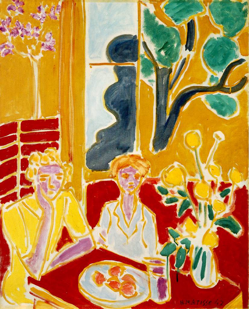
a painting by Henry Matise

Isolation is where the focal point isolated all by it's self. You cant really see anything else in the photo it's a little blurry. The girl is the only visible focal point. She seems to be looking right at us.

Only one focal point. This house or church is the only focal point in the picture its off center to the field and sky. The color draws you in as it is in contrast to everything else.

Placement of the focal point. The small pumpkin is set way to the right of the other pumpkins. It would not be the focal point if it looked similar to the other pumpkins. This one hangs from a string and seems to have two pumpkins grown together. The unusualness of this pumpkin draws us to where ever it would be on the painting. Also because it is different we tend to go and look at the other pumpkins to see the differences which directs your eye around the painting
Friday, February 3, 2012
Grid as an organizing factor

This funny enough I found on a website about aliens this is supposedly Qulian DNA.
Either way the Grid pattern creates a nice design with many visual references.
chaotic, unreadable image

This is a chaotic piece that is supposed to represent a city. The only way you would know that would be by the title the author gave it "City scape"

No objective expression of unity
This has no objective except shapes color and balance to make a pleasing
design to the eye.
I had a hard time understanding the concept of this.

Figurative expression of unity
Lots of shapes, color,words make up the make the entire image. It makes sese of the design in a not so traditional way.
Wednesday, February 1, 2012
Continuation

Proximity


UNITY / Week 2

This a picture I had from the yoga training I went to. There were around 200 people in this room but as you can see the rows of people seem to go on for ever. Creating repetition with similarity in the yoga posture they are doing. I love the grid pattern of the lights and ceiling as well as the mats and towels beneath their feet.
Tuesday, January 24, 2012
Ideal 2 dimension design

Credit for the ART
Thursday, January 19, 2012
Subscribe to:
Comments (Atom)